Project mobile app
7-month contract with UniSuper

Skip project background

Project
background

App project overview

The task

Build a new mobile app for 500,000 superannuation members.

Core delivery team

  • Experience designer
  • UI designer
  • Service designer
  • UX writer (me)
  • Business analyst
  • User researcher
  • Product owner

Main responsibilities

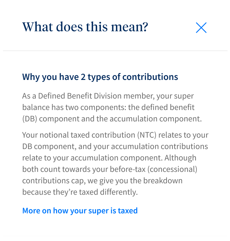
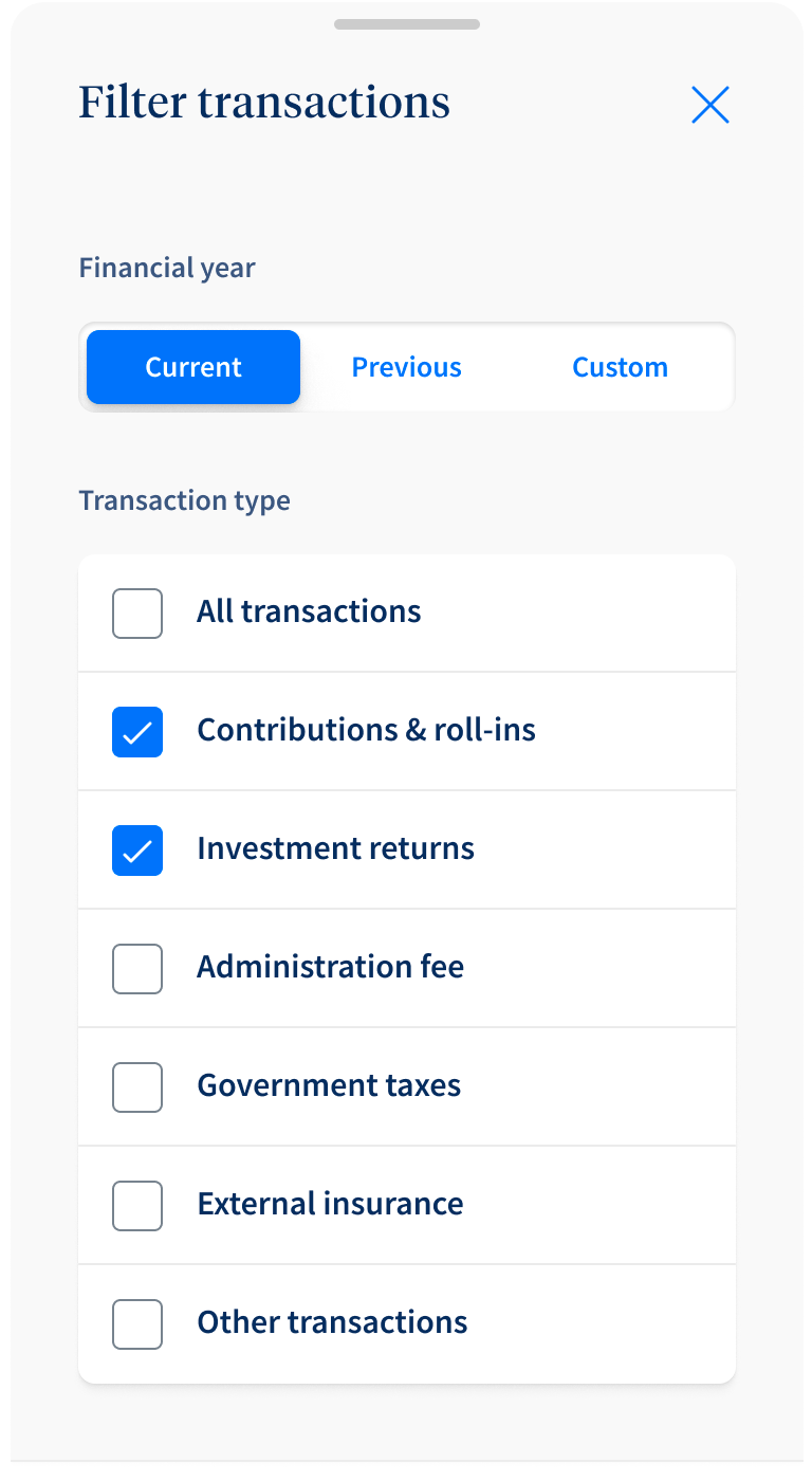
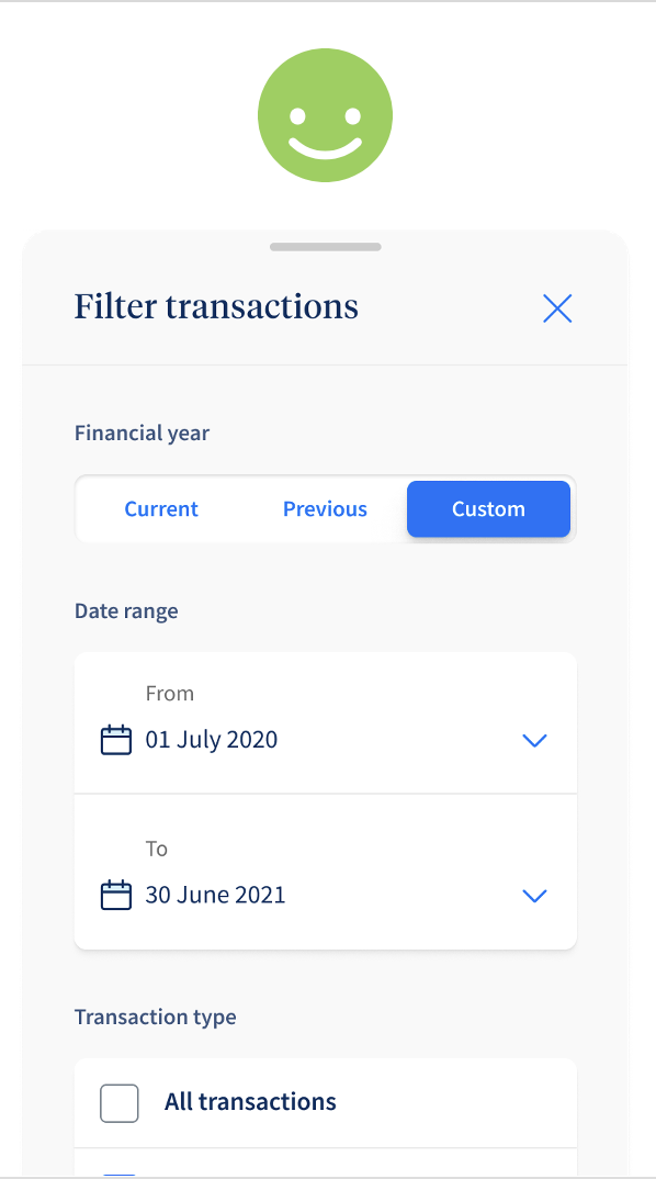
  • Produce all written content
  • Manage stakeholder approvals
  • Update style guide
  • Integrate legal requirements
  • Workshop language changes
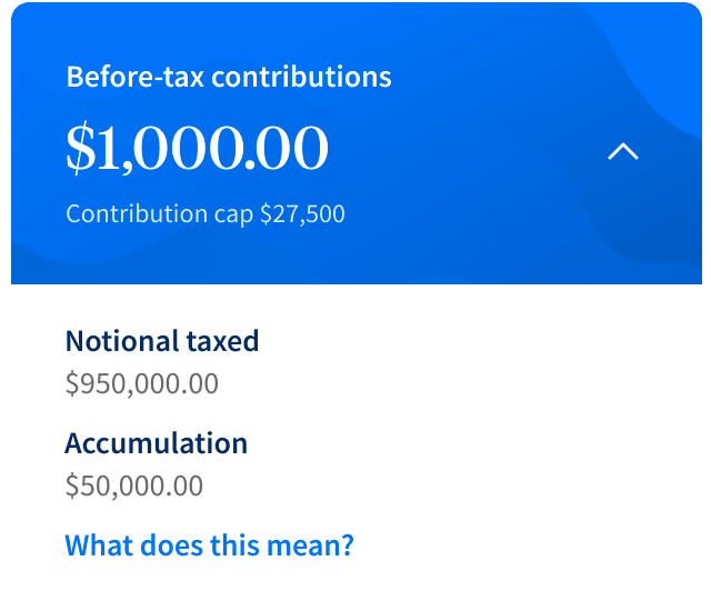
My stakeholders

  • Legal
  • Investments
  • Product
  • Developers (agency)
  • Member services

"Rob's work was top notch and he was fab to work with. Highly recommend!

Lyndon Horsburgh
Creative Content Lead @ UniSuper
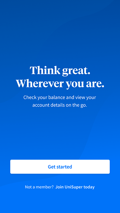
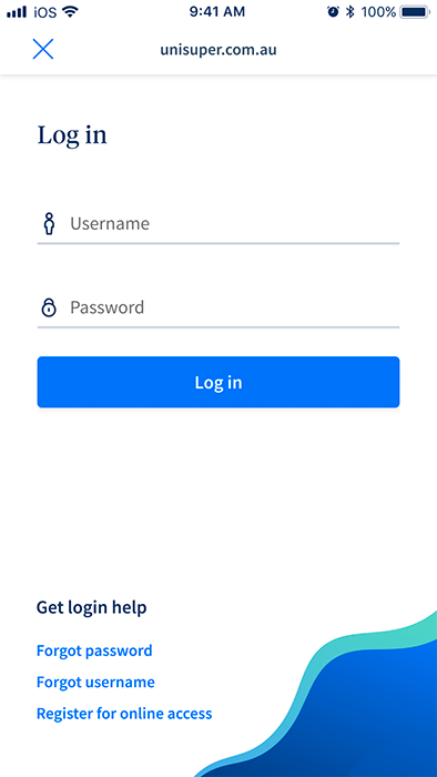
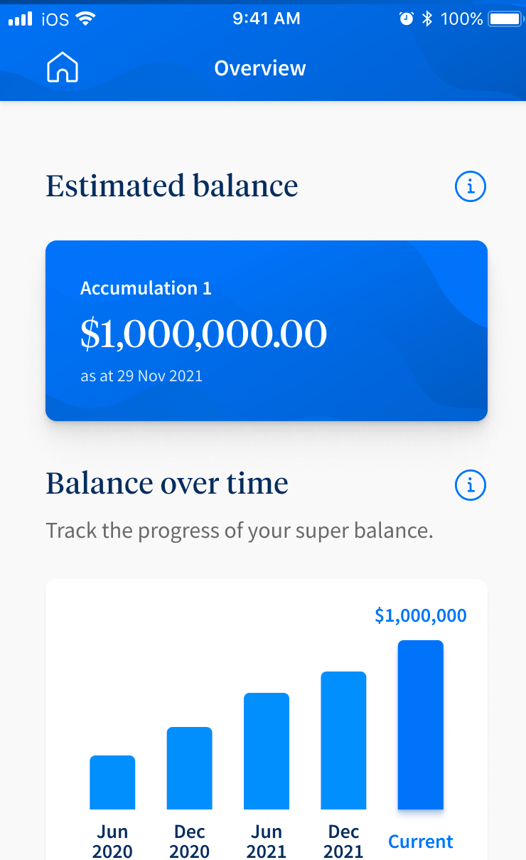
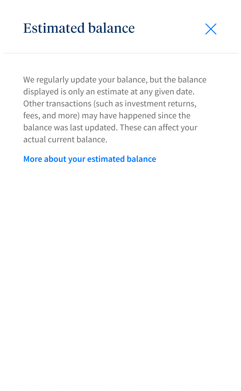
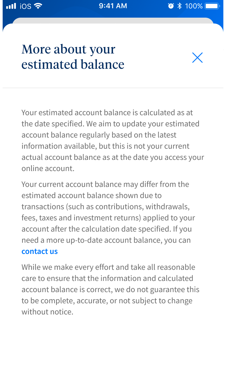
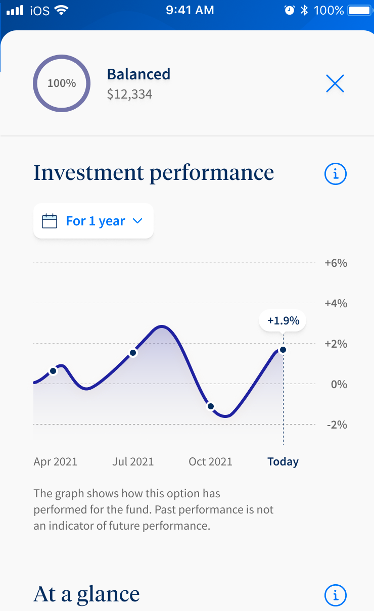
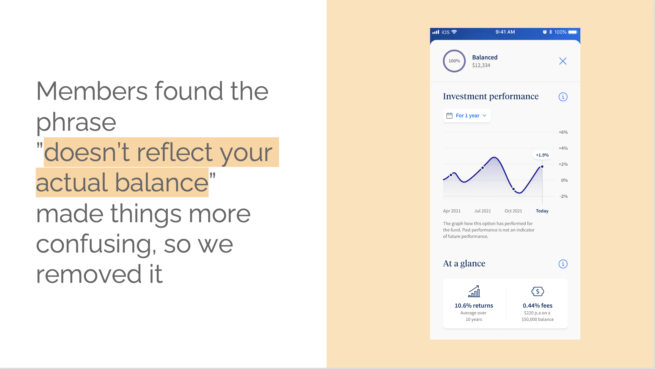
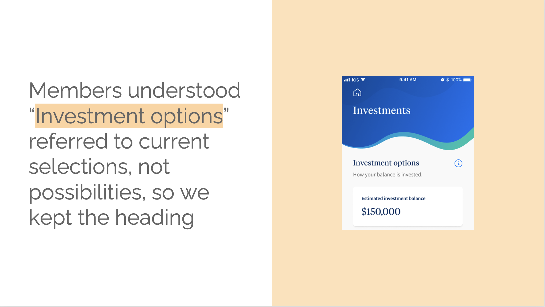
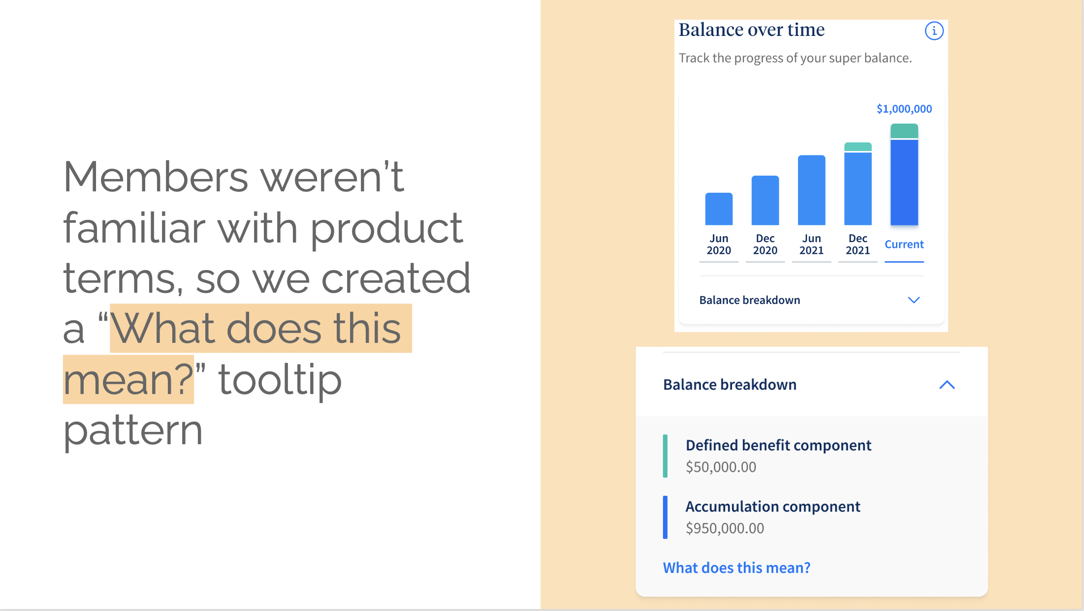
Onboarding screens

How it all started

UniSuper is one of Australia's award-winning superannuation funds. Its investment strategy has steadily been on an upward path for a wee while, but its digital presence had a big app-shaped hole in it. In 2021, senior management decided it was time to fill that hole and build an app.

That's where I came in.

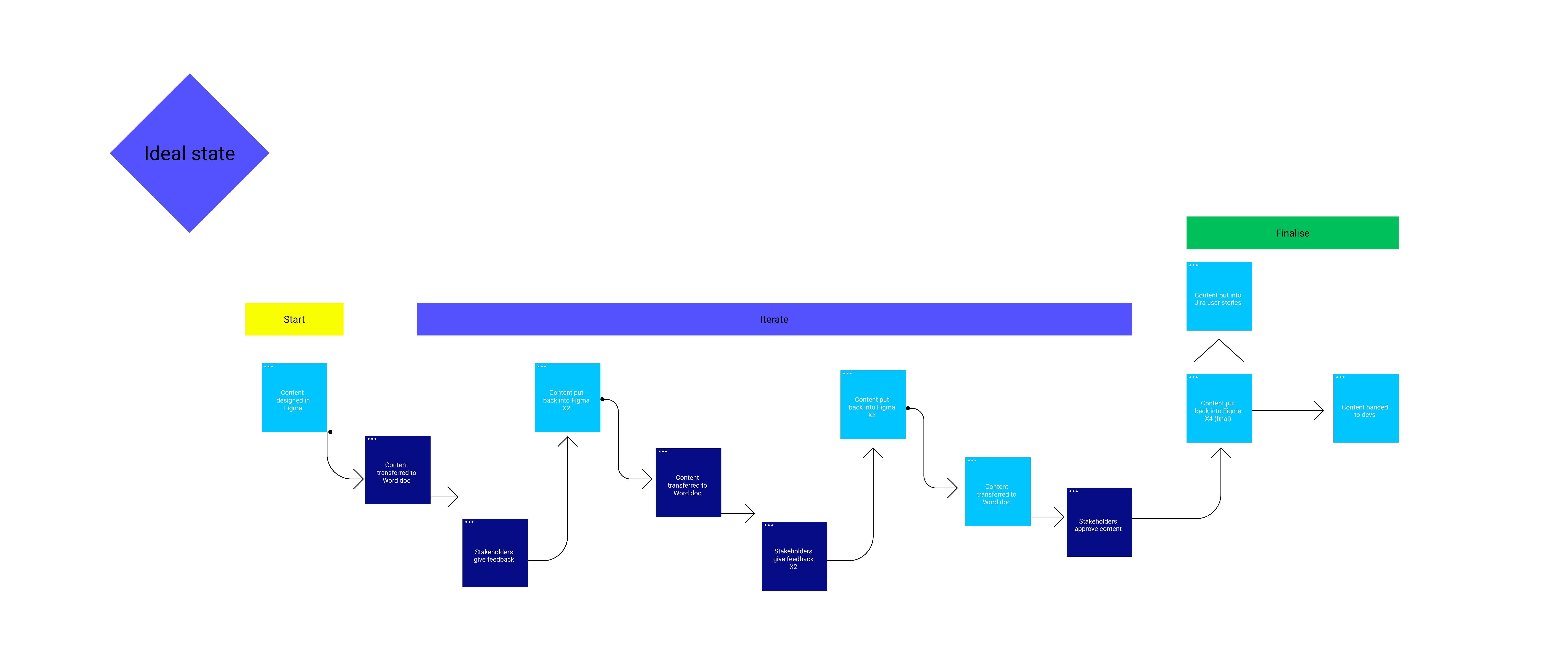
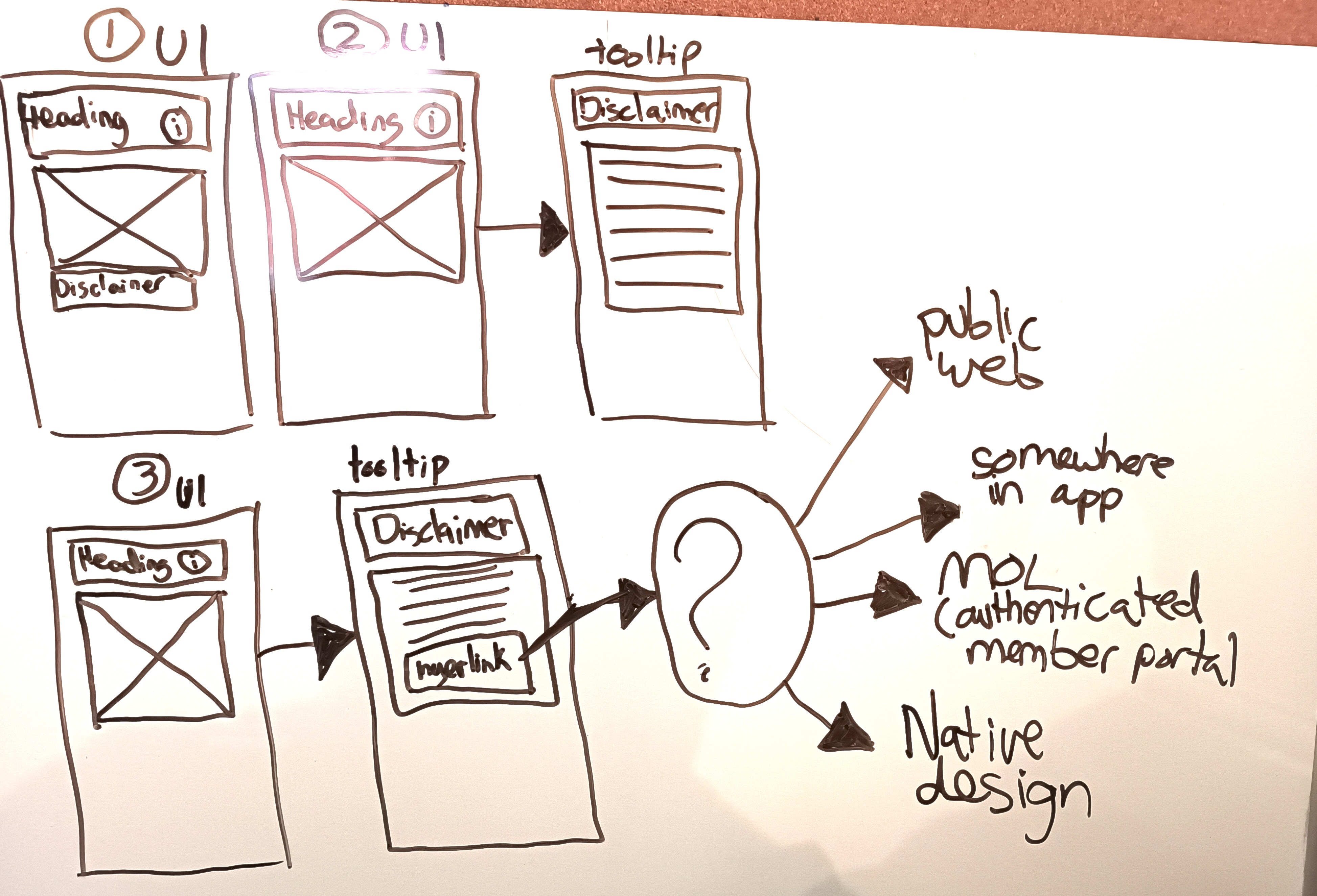
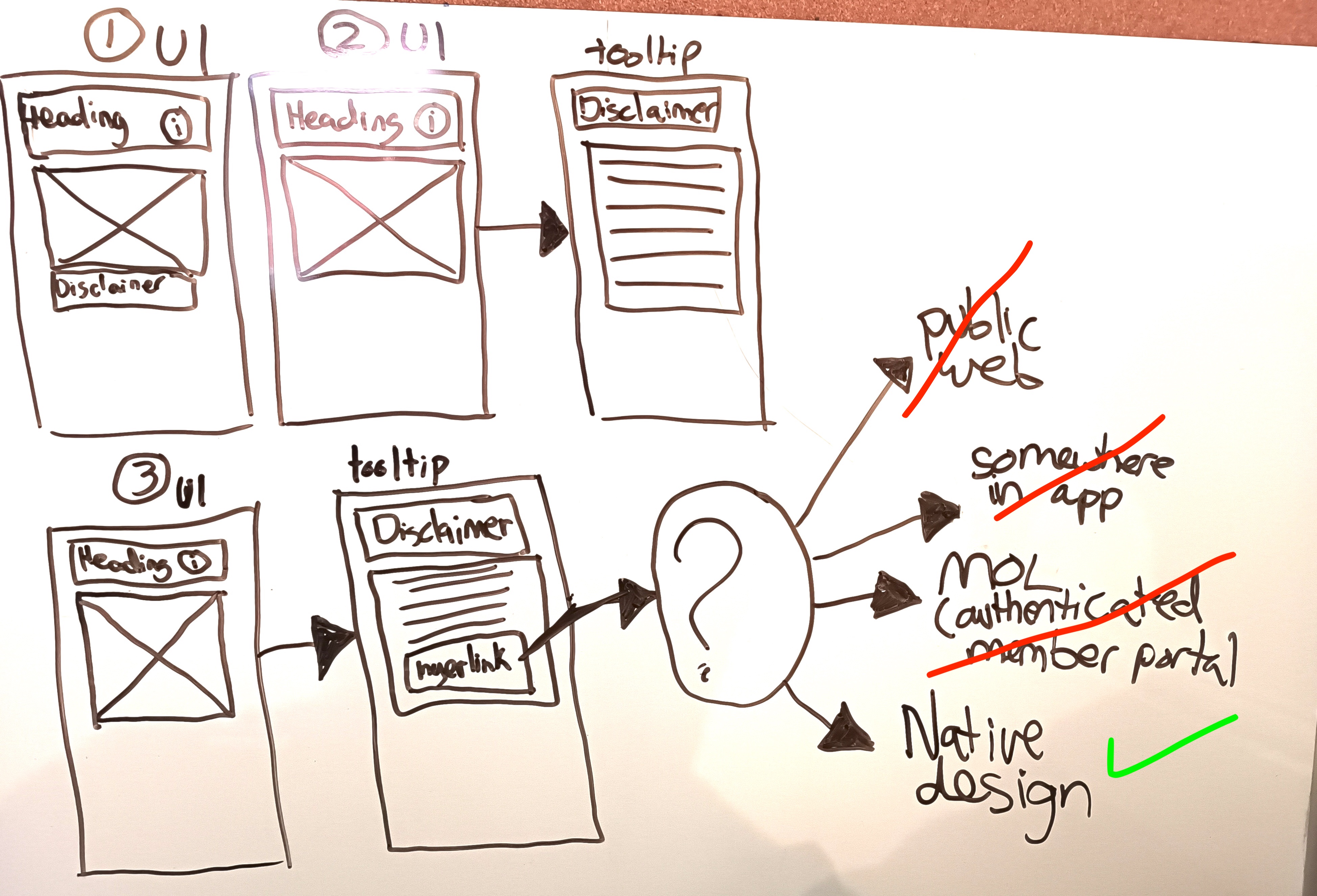
Process map: how I created, managed and approved content

Finding my feet in a new project

How did we get here?

UniSuper already had a member portal and data on how people were using it. There was already a pile of user research on what members were doing in their online accounts. Plus a competitor analysis of the challenges other funds faced in their app builds. So that's where I started. Getting a feel for where, how and why a project has landed is my first move on any new project, big or small.

Challenge

Our first content problem

From desktop to mobile

Because finance is a highly regulated industry, digital experiences can get messy with legal jargon and disclaimers. UniSuper was no exception. In the existing member portal, I found long-winded disclaimers stuffed wherever they'd fit. Space wasn't an issue because it was a desktop-first platform. The app was a different story.

Disclaimer examples from the existing portal (not my work)

Framing the challenge

The question I wanted to answer...

If we need to use a legal or jargon-heavy disclaimer, can we create a consistent pattern that presents the disclaimer in a mobile-friendly way? And how are we going to do it?

Problem
solving

Time to explore the possibilities

The fun part

The obvious place to put legal disclaimers was in tooltips. But with our design pattern, tooltips were already doing heavy lifting. And I wanted to keep them useful, not a dumping ground for legal requirements. Because this was a content problem, it was my job to squeeze the ol' brain juices and come up with some ideas for what we might do.

Blame law school & its 3-hour handwritten exams for my abysmal handwriting

A reality check: refining our options

Refinement's always collaborative. Here's what I found when I tested my ideas with the teams:

  • Put disclaimers below the UI components and hope for the best (sometimes useful, sometimes not)
  • Put disclaimers below all the UI components, at the bottom of the screen (sometimes useful but legally iffy)
  • Put disclaimers in tooltips and hyperlink to a page on the public website (blocked by stakeholders)
  • Put disclaimers in tooltips and hyperlink to a page in the authenticated member portal (hard to manage)
  • Put disclaimers in tooltips and hyperlink to some other page in the app (bad UX & not in budget)
  • Put disclaimers in tooltips and hyperlink to another design component

Sometimes you can lead with user-centred design AND keep legal happy – go figure

The solution

*throws (biodegradable) confetti*

Finally, after a few laps with various stakeholders, we landed on a good (ie, my preferred) solution: hide icky content behind a hyperlink that triggers a second tooltip overlay.

The second overlay gave us another option to include meaty information and keep it proximate to the abridged, user-first (instead of legal-first) content. It meant we could meet legal requirements without sacrificing the user experience.

Tooltip flow: using content to solve problems with design

Disclaimers & tooltips: balancing legal requirements with helpful UX

Decision
making

How I choose this word > that word

The style guide is where I look first to make decisions about form, style, syntax, word choice, etc. But style guides only take you so far. And this was a new app so I was in unchartered waters.

Here's what got me through...

  • best-practice know-how
  • my UX-writing principles
  • early collab with designers & stakeholders
  • user research and testing (more below)
  • good old-fashion common sense

Acronyms aren't accessible and full words can make content easier to scan

Different context, different message tone

A voice map I created to guide messaging (based on the original voice guidelines)

Consistency happens in the small decisions

Documenting decisions in the style guide

Consistency. Is. King.

I wanted to capture decisions I made on the fly and feed them back into the broader guide. It's a work in progress but these were some bits I passed on to the team.

General guidelines to integrate UX-writing principles into the guide

Error messaging 101

Research &
insights

Testing my assumptions

When you think you're right,
you're probably wrong

With tight sprint deadlines and a fully allocated budget, testing was limited. But I did connect with our researcher for some qualitative testing on our major features. I wanted to see how familiar members were with product names and industry terms. We got some insights that were (unsurprisingly) surprising.

In the interviews, 8 out of 10 members got stuck on this phrase

I found the word 'options' ambiguous; our members didn't

One assumption was correct: members had no idea what products they were in

Final thoughts & "learnings*"

First of all, I learned a metric shit-tonne about superannuation and how it operates in Australia. I consider myself lucky when I can get elbow-deep in a new industry. It's a perk of the job I value.

Workflows matter

In big projects like this, I've found design teams can sometimes be intentionally isolated from project-management stuff. Reasoning: isolation helps us focus and get our butts into gear. Alas, sometimes it also means we fall out of sync with other teams, like external agencies responsible for the developing/engineering.

I usually like to have a good grip on the broader delivery flow. But that wasn't always possible with the way this project was set up. Although this didn't affect my own work too much, it did have knock-on effects that meant work was sometimes duplicated unnecessarily across teams. If I had my chance again, I'd have made more of an effort (and probably been a bit pushier) to learn how the agency was developing in parallel to our in-house team.

No source of truth
= source-of-pain-in-the-butt

About 95% of my work was done straight in Figma. During the stakeholder-feedback sessions, I took the Figma content and copied it into Word docs so stakeholders could leave comments and make edits. All the while, business analysts copied the content into user stories in Jira.

Building and maintaining a singular up-to-date repository of content that everyone everywhere agrees is the single source of truth probably isn't worth the effort. But agreeing on a source of truth specific to delivery workflows has the same properties as aspirin: big-time headache relief.

That's a wrap

Overall this was a super interesting project to work on with a group of super talented and pleasant people. If any of the work I produced is even half-decent, it's because I was surrounded by a great team.

*if I ever say "learnings" unironically, poke my eye